
How to choose brand colors for a small business: a simple six-step guide
Brand colors are the small set of colors a business uses again and again, so that customers recognize it at a glance. They appear on the logo, packaging, website, social media, and printed material.
Many owners choose colors by personal taste. A better way is to choose them with a purpose. This guide explains how to choose brand colors in six steps, with palette examples and a quick contrast check.
Key takeaways
- Brand colors are a small, fixed set of colors that make a business easy to recognize.
- The best colors match the brand personality and suit the audience, not just personal taste.
- A simple palette has one main color, one or two supporting colors, an accent, and neutrals.
- Checking contrast keeps text readable on screens, packaging, and print.
- Writing down the exact color codes keeps the brand consistent across every channel.

What are brand colors?
Brand colors are the specific colors a business chooses to represent itself. They work together with the logo, fonts, and tone of voice to form the brand identity.
People call a set of brand colors a brand color palette. It usually has a main color, one or two supporting colors, an accent color, and a few neutrals. Each color has a clear job.
Brand colors are not the same as decoration. They are a decision, so apply them the same way every time.
Why do brand colors matter for a small business?
Customers often notice color before they read a word. A consistent palette helps them spot the business on a shelf, a feed, or a signboard.
Color also sets a mood. A calm green and a bold red send very different signals. In addition, a fixed palette saves time, because designers and staff do not have to guess each time.
Consistency matters most. deAsra’s guide to brand consistency explains how repeated use builds recognition.
How to choose brand colors in six steps
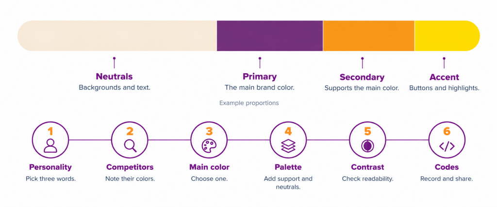
Six steps take you from brand personality to a finished palette. Work through them in order.
Step 1: Define the brand personality and audience. Write down three words that describe the brand, such as warm, trustworthy, or playful. Then describe the customer. Age, taste, and place all shape which colors feel right. deAsra’s guide to brand voice and personality can help with this step.
Step 2: Look at what competitors use. Collect the logos and packaging of five similar businesses. Note which colors appear again and again. Then decide where to follow the category and where to stand apart. A distinct main color helps customers remember you.
Step 3: Pick one main color. Choose a single color that best fits the personality. This color will appear most often. Test it on a sample logo, a social post, and a product label before deciding.
Step 4: Build the rest of the palette. Add one or two supporting colors, one accent, and a few neutrals. The next sections explain the roles and the ways to pair colors.
Step 5: Test contrast and real-world use. Check that text is easy to read on every background. Then view the palette on a phone, a laptop, and a printed sample. Colors can look different on each.
Step 6: Record and use the codes. Save the exact color codes in a simple document. Share it with everyone who makes content for the brand. Then apply the palette the same way every time.
What do colors signal to customers?
Colors carry associations, but these are general and not fixed. Meanings change by culture, region, and context. In some regions white is linked with purity, and in others with mourning.
Use the list below as a starting point, not as a rule.
- Blue is often linked with trust and calm.
- Green is often linked with nature, health, and growth.
- Red and orange are often linked with energy and warmth.
- Yellow is often linked with optimism and attention.
- Purple is often linked with creativity and quality.
- Black and gray are often linked with seriousness and elegance.
Test your choice with a few real customers. Their reaction matters more than any general guide.
What does a brand color palette include?
A simple palette gives every color a job. The table below shows the usual roles. The shares are example proportions to start from, not strict rules.
| Role | Purpose | Example share of use |
| Primary color | The main color of the brand, used on the logo and key items | About 30% |
| Secondary color | Supports the primary color on backgrounds and sections | About 20% |
| Accent color | Highlights buttons, offers, and key points | About 10% |
| Neutrals | Backgrounds and text, such as white, cream, or dark gray | About 40% |
Keep the total small. Most small brands do well with three to five colors in all.
How to combine colors in a palette
Some color pairings are easier to get right than others. Three simple approaches work well for new brands.
- Monochrome. Use shades of one color, from light to dark. It looks calm and clean.
- Analogous. Use colors that sit next to each other on the color wheel. It looks harmonious.
- Complementary. Use colors from opposite sides of the wheel. It looks bold and lively.
Start with your main color. Then add one supporting color from the approach that fits your mood. Add neutrals last.
What do brand color combinations look like?
The pairings below are illustrative only. They show how the same logic works for different small businesses.
- A home bakery: warm brown as the main color, cream as the neutral, and soft pink as the accent.
- A tuition centre: deep blue as the main color, white as the neutral, and bright yellow as the accent.
- An organic food brand: leaf green as the main color, earthy brown as the support, and a warm orange accent.
Each pairing starts with one clear main color. The rest follows from it.
How to check that brand colors are readable
Good colors are useless if the text cannot be read. Test the contrast between text and its background.
The Web Content Accessibility Guidelines, known as WCAG, set the standard. As of 2026, level AA asks for a contrast ratio of at least 4.5 to 1 for normal text. Large text needs at least 3 to 1. W3C explains this in its guide to contrast minimum.
Light yellow text on white fails this test, while dark text on cream usually passes. Check every text and background pair before you finalize the palette.
Which color codes should a business record?
Different channels use different color formats. Record the code for each one so the color stays the same everywhere. The table below explains the common formats.
| Format | Where it is used | What it looks like |
| Hex | Websites and most design files | A hash sign followed by six characters |
| RGB | Screens, apps, and social media | Three numbers for red, green, and blue |
| CMYK | Printing | Four percentages for cyan, magenta, yellow, and black |
Print colors can look different from screens. Therefore, always request a printed sample before a large order.
Where should a business use its brand colors?
Apply the palette in the same way across every touchpoint.
- Logo and business cards.
- Website, social media profiles, and post templates.
- Product labels, boxes, and bags.
- Signboards, uniforms, and printed material.
deAsra’s guide to packaging design as branding shows how color works on products.
What mistakes should a business avoid?
A few common mistakes weaken a color palette.
- Choosing colors only because the owner likes them.
- Using too many colors, which makes the brand look scattered.
- Copying the exact palette of a competitor.
- Ignoring contrast, so text is hard to read.
- Using slightly different shades in different places.
- Changing the palette often. If a change is truly needed, plan it carefully with deAsra’s guide to rebranding without losing customers.
Conclusion
Brand colors are a small choice with a long-term effect. They help customers recognize a business, and they set the mood of everything it shares.
The process is simple. Define the personality, study competitors, pick one main color, and build the palette. Then test contrast and record the codes.
Start this week by writing three words that describe your brand. Then test one main color on your logo, a social post, and a product label.
Your next step

Frequently asked questions
What are brand colors?
They are the small, fixed set of colors a business uses to represent itself. They appear on the logo, packaging, website, and social media.
How to choose brand colors for a small business?
Define the brand personality and audience, and study what competitors use. Pick one main color, build a palette around it, and test contrast. Then record the color codes.
How many colors should a brand have?
Most small brands do well with three to five colors. That usually means one main color, one or two supporting colors, an accent, and neutrals.
What is a brand color palette?
It is the full set of colors a brand uses, each with a clear role. Typical roles are primary, secondary, accent, and neutral.
Should print and screen colors match?
They should look as close as possible. Record the hex and RGB codes for screens and the CMYK values for print. Always check a printed sample, because screens and paper show color differently.